


Research in perception and human reliability has shown that reaction time increases and response accuracy decreases as the number of elements in the display screen increases (Tufte 2001; Ngo and Byrne 2001, Xing 2004). A report by Cummings et al. (2010) has identified display complexity as one of the key contributors to human error. Research cited in that report also shows that the complexity of a display as a whole will be a function of the complexity of discrete patterns or objects, and the complexity resulting from the variable orientations and locations of these patterns or objects. Human errors made while viewing displayed information can result from errors in navigation, execution, interpretation, and the selection and use of immediately available information. Previous guidance suggests that potential reasons for human error include inaccuracies in the information presented, illogically organized data, mispositioned labels and other descriptors, and inconsistent messages to users. (Banks and Weimer 1992; Gilmore, Gertman, and Blackman 1989). In the past, hardware issues such as phosphor persistence and screen flicker were also believed to influence display navigation and to interfere with aspects of comprehension and interpretation. From a human factors approach, improved display design including control of the display density was considered an easy fix for this problem.
Over the past 20 years, a multitude of advances in hardware and software technologies have given designers much broader and more effective flexibility in screen design and the crafting of human-system dialogue. Along with these advances has come the realization that the increased ability to present information to operators has its own problems. One suggestion for improving performance is to reduce the sheer volume of information present on the screen, but an almost stronger tendency is to increase the information available, often at the suggestion of the end user. This being the case, we should ask, what is missing in the definition and assessment of
Human factors specialties, such as human reliability analysis (HRA), are beginning to recognize the importance of screen design and human system interaction in automated environments as contributing elements in response to operational disturbances and are attempting to refine the current generation of methods (Gertman 2012). Recent research (Xing 2004) sponsored by the aviation industry reviewed the complexity factors of variety, quantity, and relations and sought to map them to perception, cognition, and action (Gertman 2012). However, before HRA can be improved, the phenomena and effects of complexity in screen displays on operators’ understanding of plant status and related errors must be understood. This paper addresses the important aspect of assessing and understanding complexity in screen design.
Additional approaches regarding complexity include research at a systems level in terms of emergent systems properties and performance, the degree of uncertainty, and the extent of subjectively experienced difficulty. Complexity concepts considering these kinds of factors are presented by Walker et al. (2009).
The complexity of the human-system interface involves more than just screen display density. The approach used in this paper examines display screen density, DC, in relation to contextual importance and semantics, and relations among various elements of screen design. This is done by examining a number of concepts illustrated with example cases of contemporary displays. This approach presents a qualitative means for conducting evaluations that can be used in the design of displays, or if more empirical limits are desired, to help in the design of studies to determine boundary conditions. This approach can also be used when determining the appropriate levels assigned to performance shaping factors when conducting HRA.
2. ESTIMATING SCREEN DISPLAY DENSITY
The density of an existing display can be estimated by dividing the screen area into a grid. Each grid element is assigned a density value based on the number of objects (or parts of an object) contained within it. The distance from each object within the grid to the centre of the grid element is subtracted from the diagonal length of the grid element and added to the density tally for that grid element (adapted from Faichney 2004) as expressed by
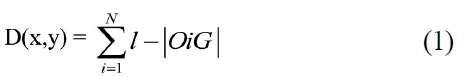
where:
D is the density at coordinates (x,y)
N is the number of objects within the grid element
l is the length of the grid element’s diagonal
|OiG| is the distance from the centre of object Oi to the centre of grid element G.
The maximum density would be
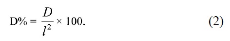
Visual Density as a percentage of maximum potential density per grid element is thus expressed by:
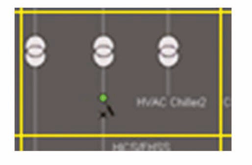
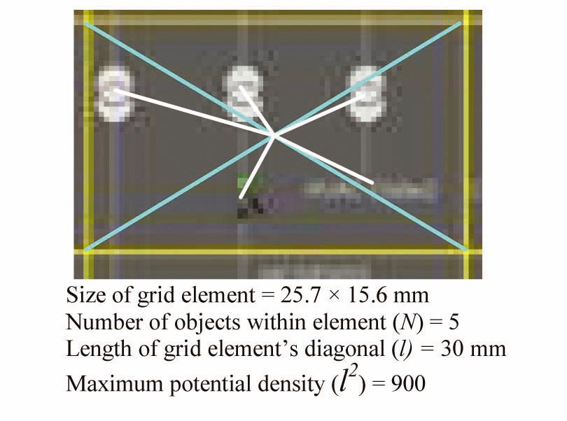
In the first example, a single grid element captured from an HSI screen is shown in Fig. 1.
The five significant grid elements in Fig. 1 are identified in Fig 2.
The calculation of the OiG value of the five grid elements (numbered clockwise) are:
O1G : 30 - 11.34 = 18.66
O2G : 30 - 4.05 = 29.95
O3G : 30 - 6.7 = 23.3
O4G : 30 - 7.45 = 22.55
O5G : 30 - 4.84 = 25.16
Thus:
D = 119.62, D% = 13.3
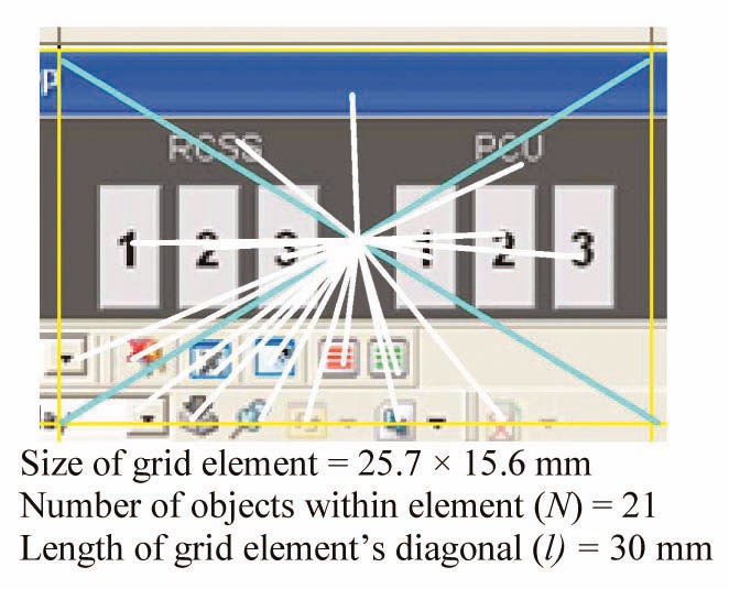
A second grid element captured from an HSI screen is shown in Fig. 3.
The 21 significant grid elements in Fig. 3 are identified in Fig. 4.
The calculation of the
D = 475.82, D% = 52.87.
The total density of a whole display would be obtained by calculating the sum of all D and D% values for the display. Note however that display
3. ESTIMATION OF DISPLAY COMPLEXITY
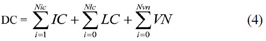
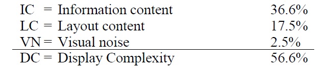
An approximation of DC is obtained by using an approach analogous to Tufte’s (2001) “data ink ratio” to determine the ratio between three key components:
? information content (IC) ? the discrete elements of an image that have the potential to convey meaning to the observer
? layout content (LC) ? additional elements in the image that help to organize the IC, but do not convey meaning themselves
? visual noise (VN) ? elements in the image that, at best, occupy space in the image without conveying any meaning or helping to organize meaningful elements, or at worst, interfere with the inherent meaning of the image.
Thus, in any particular display:
DC = IC+LC+VN.
This expression is intended to illustrate the following concept:
1.Maximum meaning in an image is conveyed by elements that have IC, such as text, icons, symbols or pictures.
2.Meaning in an image may be enhanced by adding LC in the form of demarcation lines, arrows, or objectgrouping outlines.
3.Potential meaning is diminished by VN in the form of unnecessary, redundant, or detracting elements in an image. These elements (text or graphic shadows, patterns, fancy fonts, borders, etc.) can be omitted without affecting the meaning in any way, but when present, they negatively affect (diminish) the observer’s ability to obtain meaning from the image in direct proportion to the area of the image occupied by such elements.
This approach however evaluates neither the meaning nor the relative importance of the various elements in the display. This requires an examination of the semantic content of an image.
4. SEMANTICS AND ESTIMATION OF SEMANTIC COMPLEXITY
Although it may appear simple, a display low in visual
Loosely defined, semantics is the study of properties of meaning in language. Early research by Osgood (1962) employed a scalar technique using the semantic differential (SD) that broke semantics into activity, potency, and evaluative dimensions. In simple applications, a score is derived for a concept representing a composite for a concept, word, or phrase.
The research appeared in the clinical literature and reasonable validity and reliability estimates were obtained, and as a result the method was successfully applied for a number of years. Judging by the number of articles that address the use of the SD, it could be used in display evaluation, either as a discriminator among process variables as they change value, or in the meaning associated with various commands and interactions (Heise 1965). Whether this or a similar approach could be used to aid the selection of HSI symbology or use of metaphor in displays could be the topic of future research.
5. HISTORICAL ASPECTS RELATED TO THE ESTIMATION OF SEMANTIC COMPLEXITY
Findings from Gennari and Poeppel (2003) suggest that verbs or words that refer to things that are static take less time to mentally process than do those referring to causally structured events. They found
Earlier research by Brennan and Pylkkanen (1988) established longer eye tracking and reading time findings for contextual SC when compared to words in a noncoercive, contextual complexity, control group. Just as in the case of contextual SC, higher levels of lexical SC are associated with internal processing such as reading and decision times.
The phenomenon of syntactic complexitya in information presentation is well studied (Ben-Shachar, Palti, and Grodzinsky 2004; Caplan et al. 2002; Ferreira and Clifton Jr. 1986; Frazier and Fodor 1978; Gibson 1998, Brennan and Pylkkanen (2012). Many interface designers try to consider the syntactic complexity associated with procedures and warnings and perhaps will do so in their design of computer based procedures. It is less clear how often SC is considered in nuclear power HSIs by designers. For our purpose, we define syntactic complexity as a structural aspect of displays, in particular expressed as a function of the number of constituents of a syntactic construction. Another aspect of design and the issue of SC that would benefit from review would be the determination of the impact of
a A number of definitions for syntactic complexity exist and include: the frequency of grammatical structures, word count, verb phrases, clauses, dependent clauses, mean length of sentences, etc. For work in this area see Liu 2010 or Ortega 2003.
6. THE APPLICATION OF SEMANTIC COMPLEXITY IN DISPLAY DESIGN
The primary purpose of observing (“reading”) a computer display is to obtain information and eventually convert it into meanings that guide actions. Obtaining meaning in this way enables the user to make a decision, perform a task, etc. It would thus make sense to express the difficulty with which a person obtains meaning from a display as being the result of SC inherent in the display, rather than cognitive complexity, which is the effect of SC. Also, using cognitive complexity assumes a number of things, such as the type and number of mental structures involved, and possibly, a simplicity-complexity continuum, and personal perceptual and interpretive skills related to cognitive complexity, all of which may not be the same as SC. Literature further suggests that cognitive complexity has a lot of communication aspects that are not directly related to display design (Burleson and Waltman, 1988; Caplan, 2002). Beyond communication and personality relationships to cognitive complexity, there have been research efforts to define cognitive complexity in terms of cognitive demand. With that model in mind, complexity may be defined as having the characteristics of contrasting and comparing procedures or concepts, performing multiple steps with multiple decision points, justifying solutions, extending patterns, etc. Much of this later research focuses on skills required to respond to test items (Webb 1999).
It also seems clear that the meaning of an individual object on a display (a piece of text, an icon, etc.) is influenced directly by its relative importance as it is perceived in the context of the display and the overall context of the task.
As indicated in Section 3, the ability to obtain meaning from a display may be enhanced by the presence of layout content (LC). Also, the amount of VN in a display may inhibit the ability to obtain meaning from it. The value of IC is reduced by the presence of VN, and when VN becomes more than IC, the resulting ratio might lead one to falsely conclude that a display is less complex because IC is low. However, a screen is not necessarily less complex because there is a lot of VN. On the contrary, the overall visual complexity can be higher, simply because it will consume more cognitive resources to find meaning among the clutter. This effect can be compensated for by considering the relative importance of a display element. The IM weighting factor would be derived from the inherent meaning of the element in the context of the overall display.
When IM is added as a weighting factor, the relative SC―an expression of how difficult it would be to determine the meaning of individual elements and the display as a whole―can be estimated. Difficulty in this case could be measured in terms of
Semantic complexity can thus be expressed as:
SC = (IC x IM) + LC - VN.
In other words, the potential meaning of the information elements is increased by the contextual importance (IM) and is further enhanced by the organizational elements (LC) in the image. When all these elements are combined, they contribute to the relative ease or difficulty with which an observer is able to obtain meaning from the image.
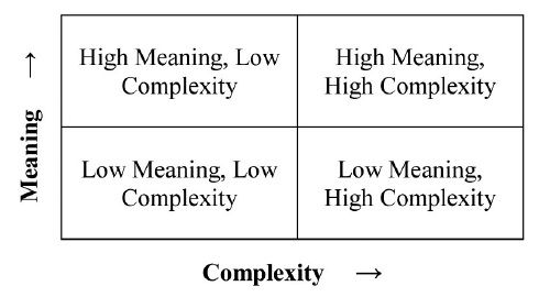
The image can now be described as one of four possible relationships between SC and DC:
? Low meaning, low complexity
? Low meaning, high complexity
? High meaning, low complexity
? High meaning, high complexity
Expressing the complexity of an image in this way, rather than simply considering visual complexity, can account for all the factors that influence a person’s ability to obtain meaning from the image: information, layout, noise (interference) and importance.
On a qualitative scale from least to most, this relationship between meaning and complexity can be illustrated as:
7. A SIMPLE METHOD TO ESTIMATE COMPLEXITY
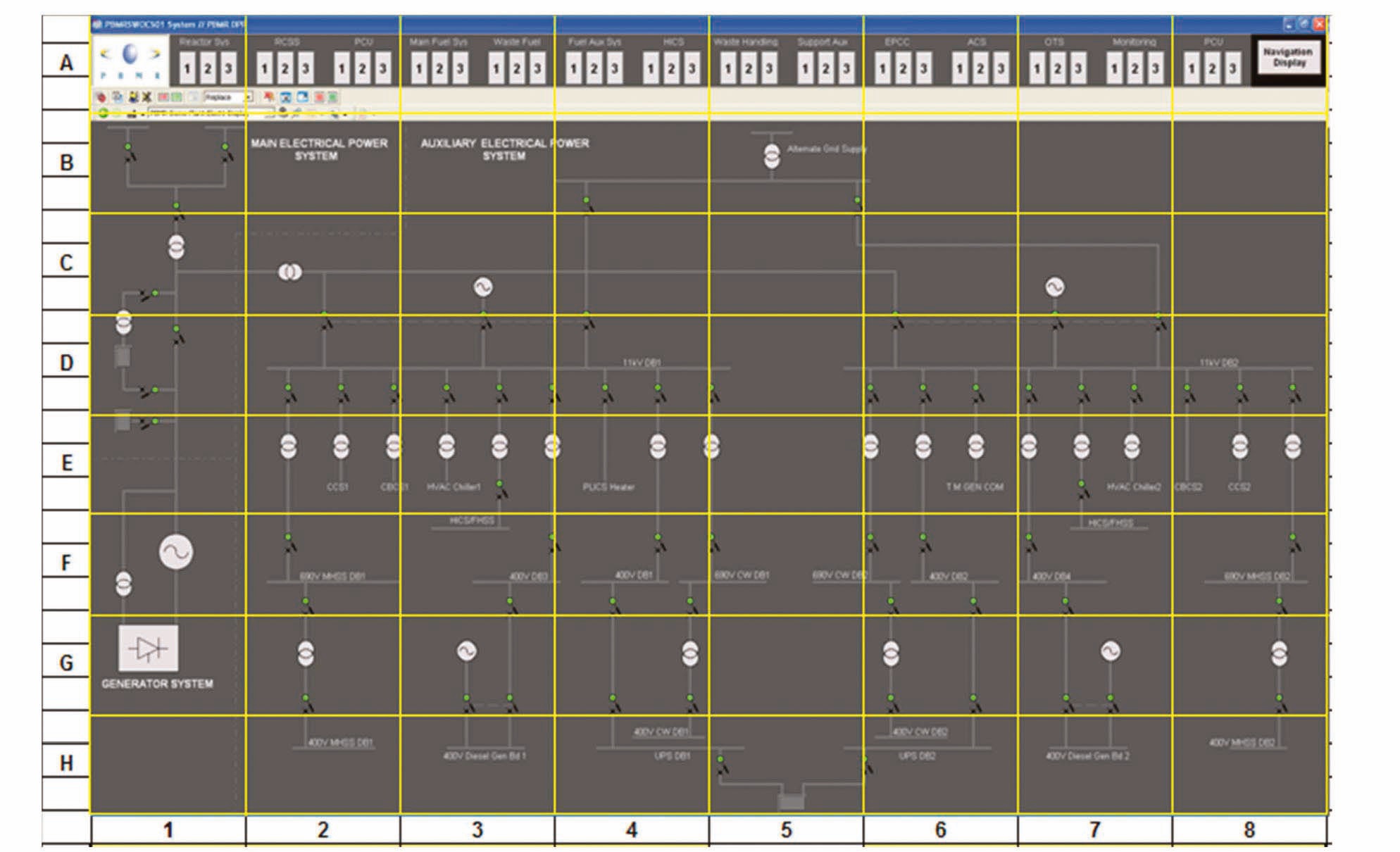
To estimate DC, an image is divided into an 8×8 grid (similar to the method for density calculation described in section 2) as shown in the single-line electrical equipment layout display in Example 1.
As shown, a rough estimate of the density per grid element DC can be obtained by calculating the sum of IC, LC, and VN.
The overall DC for the whole display is now obtained by the simple calculation
where:
Nic is the total of IC values in the grid
Nlc is the total of LC values in the grid
Nvn is the total of VN values in the grid.
It is possible for a single grid element to contain no information elements, but IC must be at least 1 for the image as a whole (there must be at least one information element for the image to make sense), but it is possible for LC and VN to be zero.
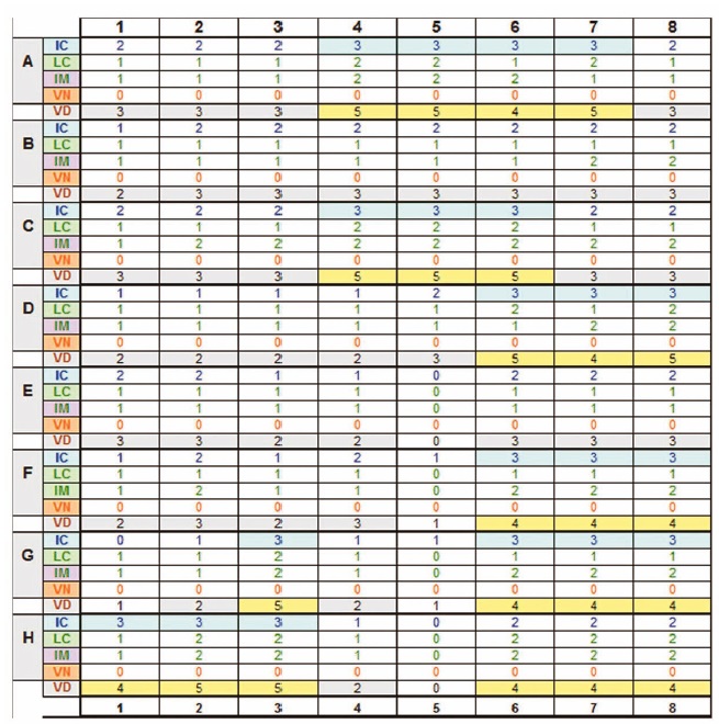
The following values were obtained for Example 1:
As shown in the grid, Importance per element was also estimated in order to obtain values for overall VD and SC [SC = (IC*IM)+LC-VN)]:
IM = Importance 19.7%
VD = Visual density 56.6%
SC = Semantic complexity 22.2%
Note that these values would only be meaningful relative to a comparative display. Compare this example to the alarm annunciator example in Figure 2.
Example 1
An Excel spreadsheet is used to rate each grid element on a 5-point scale for IC, LC and VN.
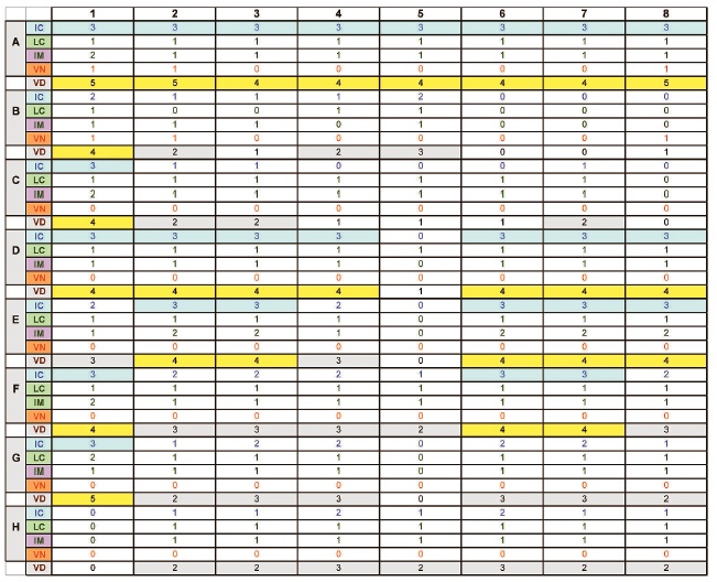
NOTE: The VD rows in the grid above is just used as a check to ensure that the maximum of IC+LC+VN cannot be more than 5.
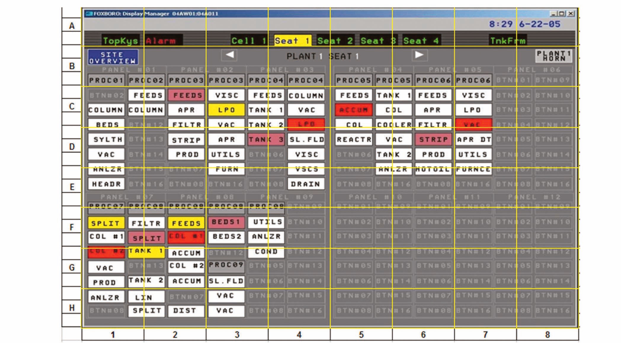
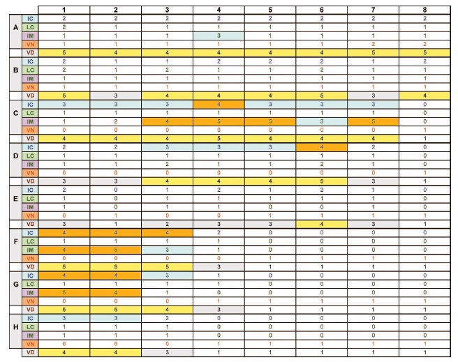
Example 2:
The table below shows the results obtained for the above display.
Blocks highlighted in orange correspond to areas of high density on the screen. These areas normally also correspond to high IC. For this example:
IC = 35.3%
LC = 15.9%
IM = 25.6%
VN = 12.2%
SC = 12.8%
DC = 63.4%
This indicates a screen with lower SC (SC = 12.8%), but higher element IM (IM = 25.6%) than the first example, which means that it would be slightly easier (quicker) to obtain meaning from this screen, in spite of the larger VN value. This is because of the relatively low IC (35.3%) and low LC (15.9%). Although the overall DC is higher because of the high VN, this is offset by the high IM, which makes it easier for the operator to pinpoint the elements with high meaning.
NOTE: If the display design has an obvious grid pattern or row/column layout such as this example, it might be useful to adjust the measurement grid to match the screen layout. This will reduce the number of fractional objects in grid elements. Care should be taken however that all grid elements are still the same size. Grey characters and lines in empty “tiles” in the display have been ignored. As in the previous example, the VD line in the grid below is used to check that the maximum of IC+LC+VN cannot be more than 5.
Example 3 shows a condenser mass-energy balance display, which is a so-called
IC = 40.0%
LC = 23.1%
VN = 0.0%
IM = 27.2%
DC = 63.1%
SC = 34.0%
The implication of using this kind of display is therefore that more information may be available to the operator, but it will take longer to gain meaning from the display as a whole and will thus consume more cognitive resources. In his description of the rules of the graphic system, Bertin (2011, page 12) calls this a measure of
Example 3:
This means that the potential complexity and cognitive load would be less than if the operator were required to “read” the whole display. Bertin calls this “visual selection” and this is an extermely important factor for the HSI designer to keep in mind ? there will be many instances where operators would not be required to read the whole screen
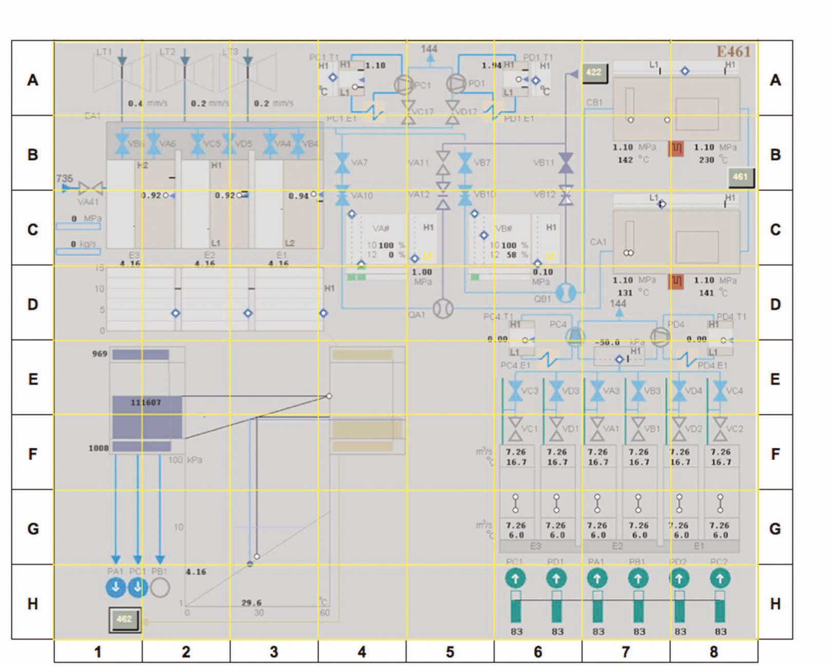
Example 3: Condenser Mass-energy Balance Display
before they are able to perform an action. This means that display designs should make it easy for operators to identify and focus on the pertinent elements. Although it is generally true that the most effective constructions will be those that can be observed and interpreted at a glance (or as Bertin calls it a
b Developed by the Halden Reactor Project.
c “If, in order to obtain a correct and complete answer to a given question, all other things being equal, one construction requires a shorter period of perception than another construction, we can say that it is more efficient for this question.” Jacques Bertin, Semiology of Graphics (2011).
8. ENHANCING THE CALCULATION BY CONSIDERATION OF SCREEN CLUTTER FACTORS
Screen clutter, defined by some researchers as “feature congestion”, is associated with problems in target detection and with visual search in general. Excess or disorganized items cause crowding, masking, and decreased recognition. One of the factors thought to influence clutter is color, owing to the relationship between color and feature detectors in the visual system. Other factors include contrast between orientation and luminance, which also have their representation in the visual system (Rosenholtz, Li, and Nakano 2007). Unusual orientation of an image or object on the screen can add to both clutter and complexity.
Rosenholtz et al. (2007) proposed a feature congestion measure for clutter, as contrasted to other approaches discussed below. The gist of this approach is the local viability in certain key features of the display. Feature congestion requires that one compute the distance, in perceptual terms, between feature vectors. This approach (which is very similar to the calculation of display density described in section 1 above), also allows for computation of texture clutter (Rosenholtz 2000). When an image contains redundancy, its coding is more efficient and hence less cluttered. These authors were also able to use this method to conduct experimentation showing that increases in color variability result in visual clutter. Rosenholtz’s computational approach for clutter includes computing local feature covariance at multiple scales and computing the volume of the local covariance ellipsoid. According to Rosenholtz, the local covariance specifies the size, aspect ratio, and orientation of the covariance ellipsoids. The method also includes combining clutter across scale and feature types and pooling over space to get a single measure of clutter for each input image. Different measures are formulated within this system as a function of feature type.
Other research focused on visual search response to clutter and clutter types based on global and local clutter. Lohrenz and Beck (2010) report findings on visual search suggesting that people start in less highly cluttered regions of displays and work their way towards areas of higher clutter. The number of features and degree of crowding are key factors in subjects’ strategies for finding the correct information, but the measurement of the number of features and crowding become difficult in complex displays. They further distinguish between global and local clutter; the former refers to the entire display and the latter to the clutter around a target of interest. Using aeronautical charts, they determined an approach and limit for clutter at which time subjects were less willing to continue to search for information. In the control room situation, this might possibly mean contacting others in the plant for information, or shedding some tasks in pursuit of others where information might more easily be found. Building on research by Reddy and VanRullen (2007), the authors concluded that global clutter and local clutter were interchangeable with set size (feature size) and crowding respectively. Their computation for the clutter factors measures clutter as a function of
Their findings suggest that novices need lower clutter and that experts can tolerate more clutter in terms of reaching a threshold. High clutter is to be avoided altogether. Fixation locations are defined as a 40×40 pixel region in an area that spans 2 degrees of visual angle.
Other measures of clutter include the edge density measure of clutter, a subjective measure suggested by Mack and Oliva (2004) that can be used as part of display acceptance test. In fact, cueing response reduces any effect of set size.
9. MITIGATING SCREEN COMPLEXITY WITH AUDITORY GRAPHS
Using sound to represent quantitative information may help diffuse visual complexity while making information increasingly accessible to operators and other users. Some work in the use of sound to aid in the identification of quantitative trends was recently performed by Nees and Walker (2008). The authors note that trend plots are being used more and more to present information that could not easily be grasped by the presentation of digital data alone. This was explored in minor detail in the previous section, but to quickly apprehend the power of graphical representation of information including the use of trends, one only needs to refer to Tufte (2001). The temptation exists for many designers to add as much as they can when designing screens, often simply because they have screen real estate available, thus overloading the user. Part of this has to do with the high resolution offered by new visual display devices, which makes it easy to create legible high density displays, but also allows creating a large number and types of relations inherent in the display.
In human-centered design it is common to make some information redundant by displaying it in alpha-numeric as well as graphical form, but using auditory displays to complement the presentation of graphical trend plots is not common. Even if complexity for a single display is not overpowering, the addition of more and more displays simply to get important information across to the user can result in slower and less accurate reaction times, thus having potential impact upon safety and efficiency. Although some approaches to this challenge have been to allow for tagging information to a particular part of the display as a mediating strategy, this is not the same as the use of properly design auditory presentation of quantitative information (Nees and Walker 2008).
“Auditory graphs” (that is, the sonification of quantitative data) link changes across the axis, changes in the XY-axes being the most common, with changes in frequency of sounds. Shepard (1982) and others have suggested that relative frequency is the most important characteristic in sound for representing quantitative data.
There has been research suggesting that subjects can match auditory and visual graphs (Bonebright, Nees, and Connerly 2001) and this seems to be a promising application area for HSI design, but none of this research has yet been validated in industry. A number of outstanding issues must be addressed before auditory display can become a means of reducing visual DC. The first involves determining the duration and spacing of tones, which is the threshold for a mixed auditory and visual environment. Many current studies look at auditory graph presentation in isolation. Tempo studies suggest that auditory presentations should be on the order of 1 to 6 per second. Temporal beats and rhythms are additional factors. Also, the number of trend reversals is related to the overall accuracy of subject perceptions. When trend reversals are a distinct possibility, the use of auditory graphs is cautioned against. When trends are expected to linearly increase or decrease (the patterns are relatively simple), perception of these displays is expected to be accurate. This is consistent with findings for visual displays reported in Sanderson et al. (1989).
Display complexity can exist for a number of factors. Complexity in control room displays is commonly considered a function of the simultaneous presentation of words, numbers, symbols, and pictures (diagrams), but complexity assessment is much more than a simple counting exercise. Also, complexity is not an absolute value, and the relationship among meaning, values and the context is thought to be additional important determinants of complexity. This paper has presented a number of additional features or aspects of complexity for the reader's consideration.
One variable not directly addressed in this study is the user’s profile. This would include consideration of perceptual and cognitive abililities and limitations for a given task. An important part of this would be the operator’s performance requirements in general, and visual literacy in particular, which are thought to make some relationships among elements more or less important than others.
The issue of identification, discrimination and interpretation of texture and shading was purposely left out of this discussion of visual complexity, but the designer should be cognizant of the extent to which textures presented on the screen add to or reduce semantic complexity. When texture and shading are considered as an aspect of display design, the size, contrast, and orientation of patterns against their backgrounds are just a few of many factors contributing to operator comprehension of displayed information. As discussed in Section 8, texture is a feature that can also be associated with clutter. This area is complex and since it requires a detailed discussion of visual literacy, is beyond the scope of this paper. A more in-depth discussion of texture is found in Ware (2000).
The use of motion within the display screen may also add to complexity, unless the motion directly supports the relationships among parameters or features depended upon by the user to obtain meaning and respond appropriately.
Although a quasi-numerical method is used in our approach to express the various attributes of Display Complexity, it is not suggested by any means that this is a rigorous, quantitative approach. Nor is it suggested that the proposed method is free of subjectivity. HSI display design is not an exact science and the validity and quality of designs are highly influenced by the experience and knowledge of the designer on the one hand, and the visual literacy of the user on the other hand. However, there are very strong indications that using this method may greatly reduce the effect of